Sketch Dump for September '12!!

Ahoy Shipmates, Crew and Visitors!!!

Hello Everyone!! This is just a quick sketch dump to show you all what I have been whipping out of my new little sketchbook! Just a note: if you get the chance, run by Walmart and grab one of these puppies! I got a sketchbook called “ART1ST” brand “sketch dairy” for about $4 and it is 11×8.5″ and has 70 sheets. Great deal and good quality paper. I had forgotten how important it is to have a book at hand to capture visual ideas when they hit and man, have they been awesome!!!

So, on to the art!

And also I am excited to show the sketches below! These are the original drawings used to create a new sketch series I started called “Deck Monsters” based on inspirations from the Magic: The Gathering trading card game. One of my new posts titled “Deck Monsters Sketch Series!” has the finished versions of these drawings and shows how I used them. They turned out really awesome so read the post above this one to see the finished versions!!

Thank you all for visiting! More art for you soon! Until then…
Best be to yee’ me mateys!
May the winds be at your backs and friends be at your sides. Blessed be your journeys.
Captain Dutz


Captain's Blog #10 – Update of "8 in Spaaace! Anthology and my extra contributions!

Avast Fans, Friends and Visitors!

WOW! It has been insane here on the boat as of late!! I have been mostly anchored down with major work projects due to a large trade show that we had a ton of work for and I just returned from there a few days ago. On the Captain’s personal project side, the first Space-themed anthology out of Illopond.com‘s community of artists is now off to the printer’s!!!

It was a blast to work with the other amazing artists in this series and I look forward to many new projects with them in the future! For now, we are working on setting up promotional material and collateral so we can hit the ground running as soon as the first prints are available!

Just for fun, I wanted to post some of the additional art I helped with during the creation process of this anthology. I am very appreciative to Paul Cageggi of processdiary.com, the project lead, for letting me participate so heavily! You rock Paul and were a “blast” to work with!!!!

Do It Yourself Comic

First is the cover to the special “Do It Yourself Comic” section. We have a lot of neat hopes and ideas that kids will take this section of the book and really enjoy creating their own awesome tale of Spaaace or any other fun comic they want! I had a lot of fun creating the cover art for this and stylized it after a true comic illustrator’s page. I also was thinking a great deal of my 6 year old son so the character resembles him heavily! He was quite excited about that!

Contributor’s Concept Gallery
I was also able to help with an additional special section called the “Contributor’s Concept Gallery.” This was to showcase some of the sketch and doodle work that each of the contributor’s created while designing and laying out their tales. This was a great opportunity to use the other artist’s work and my graphic design skill set to create a section that was truly unique. 
I intended for this to look like a very aged and weathered sketchbook floating through space and then I imposed the different artist’s works onto the pages. Below is a quick look of the Gallery section that you will see in the final product! Click on it ‘cuz the Captain gave you a big picture here!

Alrighty me Mateys, I think I will stop this post here and I will have more complete information in the next post about the purchase price and locations we are looking to use to distribute the anthology for all of you waiting so patiently!

Thank you all so very much for following along with the Captain for this first anthology/publishing adventure and I will keep you all in the loop with progress on the new Spaaace anthology book #2! I will be posting the books progress here and Kodi’s story entry progress on his new blog, kodithestarfish.blogspot.com. The first layouts of the 8 pages are already posted there so go take a look!

Until the next visit from the Captain,

May the winds be at your backs and friends be at your sides. Blessed be your journeys.
Captain Dutz

Captain's Blog #9 – April Sketch Dump!

Avast me Matey’s!

Here is a quick dive into the Captain’s current world with a new sketch dump and a listing of current project progress!

Sketches!

Here are some regular sketches compiled from either my little travel pad all the way to my legal pad for notes! I don’t care what i draw on some times, as long as I get it out of my system! Ha ha!

Dr. Stahr, an upcoming character for the Kodi the Starfish.

Now this is new. I have been considering for a long time about going mostly digital in my illustration process. It is a huge time saver and it is easier to to fix mistakes and transition into the coloring stage directly afterward. My awesome wife also thinks that I will be successful at this style of illustrating and she knows my weaknesses so that is encouraging. This is also the same process that one of my favorite web comic artists, Lora Innes, uses and her work speaks for itself. So, to test out the process, I made the following two drawings in a two day period. Both were drawn straight into photoshop without starting on paper first. After working these digital sketches, I too feel that this would work for a great direction to take Kodi that still expresses my style but does so in a more modern and faster way.

My little buddy, a dragon.
 I think this is what I think Iron Man’s butler would look like if he built one, Ha Ha!

Project stuff!

1. ) Kodi the Starfish contribution to Illopond.com’s Spaaace book #2

     This is the second showing of Kodi following his debut in the first “8 in Spaaace” book from Illopond. I have now worked up the first layouts for the 8 page contribution to the anthology and those have been posted to Kodi’s new art and story blog at kodithestarfish.blogspot.com so visit and take a look! They will undergo a bunch of changes in process from those layouts to the final production but I really enjoy showing people to process. Here is the thread to the whole project and here is Kodi’s thread there too.

2. ) Secret Comic Submission

     My writer and I are very close to sending off the top secret, awesomeness submission of comic-dom!! Only time and timing will tell if it gets to go through a publisher and on to the comic book stands for you excellent visitors to seek and buy…but I will let you know if/when that happens! Exciting stuff!

Alright my friends and visitors, stay safe and keep being amazing! Till the next visit of the Captain’s Blog,

May the winds be at your backs and friends be at your sides. Blessed be your journeys.
Captain Dutz

Captain's Orders #2 – "Waisted!"

Ahoy Shipmates, Crew and Visitors!!!!

I am finally getting back to me regularly scheduled Cap’n’s BLOG’n and here is the latest installment of the “Captain Order’s” tutorial series, titled “Waisted”!

This will be a brief description of how to use elements of the body from the waist up to to really create impact in your comics and illustrations. When restricting the elements like this and leaving out the legs and lower torso, you really have to learn to focus the power in a new way. As is common with my tutorials, I will show the basic structure of the body in the way that I normally build the frame, then I will add in other elements to show the more texture and finishing extras that can help to emphasis the characters motion and stature. I will explain this in more detail below. When finished with the tutorial, I will have a finished illustration from my very first post that shows this very information put to use in a fully penciled and lightly photoshopped manner.

So lets begin!!

Element #1 – “All in the arch” 
     One of most important element of any character illustration; human, alien, monster or animal is the overall shape that character take in each image. This is where the lessons of amazing artists like Chris Oatley are so important. You must establish a proper structure in the very beginning to have everything else connect to. when done right, the art will feel well connected, when done wrong your audience will always feel a level of discomfort because something in the structure is not right.

This is why the shape of the back and ribcage is so important. It is one of the most basic structures in the body and eventually almost everything in the body connects back to it. This is where we as artist have a real level of control and can create great moments of impact. #1 – When you settle the figure in a strong, straight upward pose it automatically establishes the characters attitude as stable for the moment (or conniving with a change in the facial expression). #2 – Also, when saddened, a character generally rolls over onto itself making itself smaller to express its emotion. #3 – Then, we have a character that desires to intimidate and pound an enemy and for one like this, his chest is opened wide and back is fully arched backward to make himself larger and give him the positions to strike with.

Each is show below missing arms so that you can see how just the torso and head can begin to establish these emotions and states of mind.

Element #2 – “Up in arms!”
     Simple step, add the arms in different positions to help further the character’s visual statement. You need to ensure that the arms are still conveying the same emotion as the torso, otherwise the body is confusing its purpose and then the audience. Hint: Never give your audience an opportunity for unintentional confusion. I will separate them from the reading experience and then away from your story. Also, confusion is a powerful emotion and can be very useful in your story when used on purpose!

Correct!
What? Are ya gonna hit me with those roses?! Gotta make that arm match the torso!

Element #3 – “U talk’n ta’ me?!”
     Use the head in as many gestures as reasonable. It is a great way to add the character’s personality (cuz we probably all know someone whose neck movements do half the talking for them) and it is an awesome way to give a character a neat quirk too. A simple head tilt can convey intrigue or confusion. Also, if the head is turned in a different way than the body you can use this to help direct the reader to an area of the page or to specific information. We as artists need to use every tool at our disposal to aid the reader in following and understanding the story. And unlike a novel, we can use images wisely to direct the reader without words.

Helpless, the direction of his eyes contradicts the way his body is turning away

Our precious Fairy Queen. Honest and confused, her head still balanced at the center even on a tilt. 
( Look at the spot between her eyes and line it up to the center of the base of her neck. )

Extra note – The triangular torso
     There are many times that I only want or have time to make waist-up illustrations but I still want them to look and feel finished. To do this I angle off the drawing with either interesting clothing or shapely cuts to end the muscle groups at a clean stopping point. I like to do this by using the natural shapes of the body. In the case of humans, we can cut the shape like an upside-down triangle leaving the lower point at the base of the torso and having the two side off of that point travel along the abs and obliques to the hips. This helps to make clean lines and to slenderize the figure at the same time.

Finisher – The Winged Artist
     As promised, below is a finished image I created around July of last year. It was made for the first art contest of Paper Wings Podcast and it uses these very techniques that I mention in this post. Here is the link to the post with this drawing in it. It was the very first Captain’s BLOG post ever!!!!

All right my friends, I believe that will do it for this Captain’s Orders Post! Thank you all for visiting and I will be back soon with more awesome content. Please let me know if you have any questions!

May the winds be at your backs and friends be at your sides. Blessed be your journeys.
Captain Dutz

Captain's Rant #11 – Kodi the Starfish Art & Story Update – Page 7 Finished (finally!)

Well,
Thar she blows, the final page be found!

My goodness all, it is finally here! The last page of the first Kodi the Starfish short story! It has been quite an adventure to get here and I thank all of those that have traveled with me on his first journey! I have one correction to make to the shape of the daddy Starfish and then it will be dunski!

Alright me Maties!! I will post soon with new information and links to to purchase this short story and the entire 8 In Spaaace! Anthology by Illopond.com!
I will also be posting some new news on my career day presentation for my son’s school and new posts with inspirations and tutorials so keeps yer aye’s peeled!
May the winds be at your backs and friends be at your sides. Blessed be your journeys.
Captain Dutz

Captain's Blog #6 – March Sketch Dump!

Well, Thar yee bee!

Me long lost sketches I tell ya!!!! (Waving fists like a crazy pirate…well, wow..fairly accurate, Ha!)

Ahoy me crew and visitors! This is my first sketch dump to The Captain’s Blog and I wanted to come in with a  Boom (better than a BANG) shot from the bow of me sketchbooks n’ loose parchments.

Below are some recent doodles and finished drawings that are not really current project related but still part of my creative exercises. Each list the content, credits and context so enjoy and please let me know if you have any questions or drop a comment if you’d like!

Pencil Sketches

Toothless from How to Train Your Dragon, Property of DreamWorks Animation LLC.

As a character, I love the details and ideas built into the way they shaped him. Everything from his expressionful “ears” to his deep color and the fact that his fire is practically lightning. His many pieces build a big story behind him. The pencil art was made as a gift for my brother-in-law’s family and their 2 year old son. He is obsessed with the movie and simply dragons in general. It is a blast to see how he lights up when seeing this kind of art.

Ghost Rider from Marvel Comics

Ghost Rider is probably the first anti-hero I faced when I was younger. I did not understand why he was the way he was but I knew he fought evil and that, to a degree, made him good. Visually, he has a stunning presence that is a perfect representation of the “show of character.” At the very least, when you see him you are stricken with fear. That is one of his character’s basic purposes; to his targets, he is to be feared. Great design executed well.

Birthday Drawing for Chris Oatley!

This is the man running from a T-Rex! Silly man, I guess he doesn’t realize that the Rex is pre-occupied with the Triceratops. Well, eventually hell get it, he’s bright!

This is a sketch I did for Chris’ birthday in december of this last year. He is one of the two talented hosts ( Lora Innes is the other ) of my favorite comics and storytelling podcast, Paper Wings Podcast and a great character designer for Disney!! Check his site here if you want to be in awe of his art and teachings, yeah…I guess you could say I’m a fanboy! 
Pen Sketch
SteamPunkD Guard

This is just a quick doodle I did in my sketch book recently while waiting on a photoshop file to save ( yeah, it was a big one). I love to draw with a loose ballpoint pen when I can because I can let go of the perfectionism of erasing and just concentrate on the shape and overall look and feel. I worked up the logo for fun before I posted this. He would have been a fun character for the new Steampunk anthology #2 out of the Illopond if I would have had time but for now, he will wait in my “lightning box” until his next attack on my mind.

Alrighty me Maties!

I think that will do if for now! I will try to keep my doodle rants collected through the month and post one of these once a month just so you can see what goes on outside of the big projects on my desks.

Thank you all for visiting and check back soon! I will be posting the finished last page for the first short story of Kodi the Starfish!

Until then, May the winds be at your backs and friends be at your sides. Blessed be your journeys.

Captain Dutz

Captain's Rant #10 – Kodi the Starfish Art & Story Update – Page 6 Finished (mostly!)

Avast!

Quick update! I have been trying to slam down these last pages of Kodi’s story for the first 8 in Spaaace Anthology with illopond.com. So, here is the finished page 6 aside from corrections that I may get from the community there on the anthology site. ( I will also add in the soft glow around Kodi that we saw in page 5, Captain’s Rant post #9 ).

Thank you for checking in and until next time my friends, best wishes for happy journeys!


Captain Dutz


Update!!!!

Finished Page 6!

Thanks for looking in!

Yer Captain Dutz!

Captain's Rant #3 – Kodi the Starfish Logo Debut!!!!

Ahoy Shipmates and Visitors!!!!
Thank you for stopping by and look’n in on the The Captain’s BLOG once again!
This is just a quick concept art update and logo debut for my first children’s story; Kodi the Starfish!
Above is almost completely finished story logo! Additionally, below is a sketch dump with concept art for for my 8-page anthology entry into the new book being produced out of www.illopond.com

This will cover a very touching story for the two main characters of the book, Kodi and his best friend Kadi. In a later post I will be sharing the synopsis of this little tale and discuss future ideas for the adventures of our new little friends. 
Please enjoy the art and post a comment if you would like. Thank you all so very much for your time and attention and I will see you at my next regular post on Nov 7th. It will be titled “The Anatomy of This Artist” and it will be an in-depth introduction to myself professionally with a little personal pros about what inspires me and what my creative goals are. 
P.S. – Thanks to the wonderful community over at Paper Wings Podcast, I have been informed of another awe inspiring artist out here in the digital sea. His name is Daniel Lieske and he is the creator and artist of a story called Wormworld Saga. I am in absolute love with his work. Very few times does another artist take my breath away like this but he has done so in droves. I pray that I can soak up and learn from the windows of brilliance he shares with us. You can find him at www.wormworldsaga.com.
Till next time I wish you happy journeys,
Captain Dutz

Captain's Orders #1 – "Off With His Head!"

Well, There ye’ bee!!!
I finally made it to this killer post! 
Alright everyone, here is the first installment in my quick tutorial series. These are more to show you my methods and processes than to fully explain every way of illustrating the subject matter. I hope that these posts will help you work through your own obstacles and throw more awesome into your art.

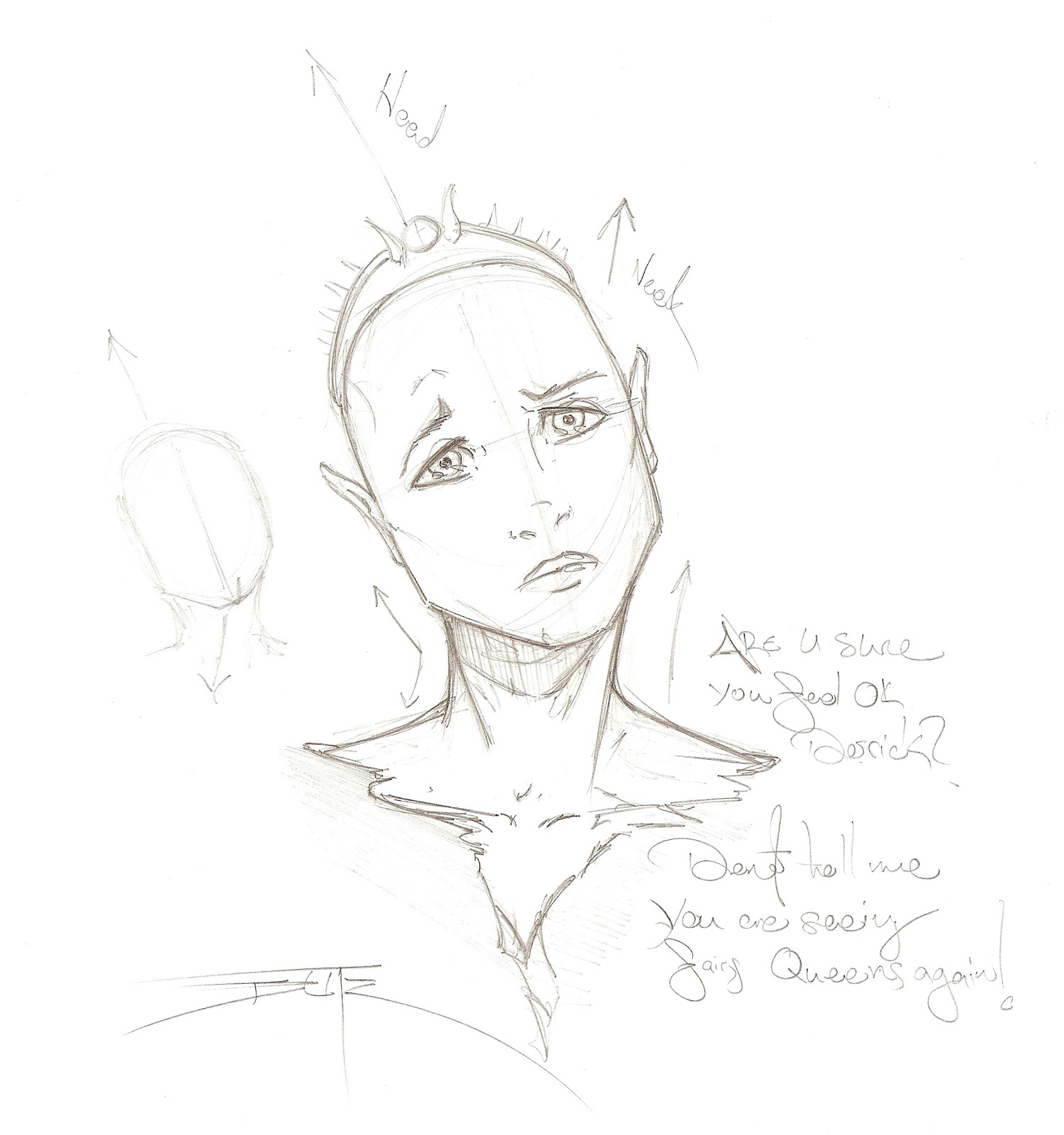
I know its early in our journey to have people walking the plank and taking heads but I want to weed out the worthless stowaways like doubt and lack of inspiration. One of the quickest ways of getting into the illustration and drawing mode is with HEAD SKETCHES!!! 
This material gets your brain artistically functioning while still working on a stable subject matter (heads don’t change in their basic structure much). This is a great way of getting your brain into the game and functioning and they can be really quick! 
Head sketches are also a great way to earn extra money going with quick commissions on your sites and at comic conventions especially!
OK, lets get started!
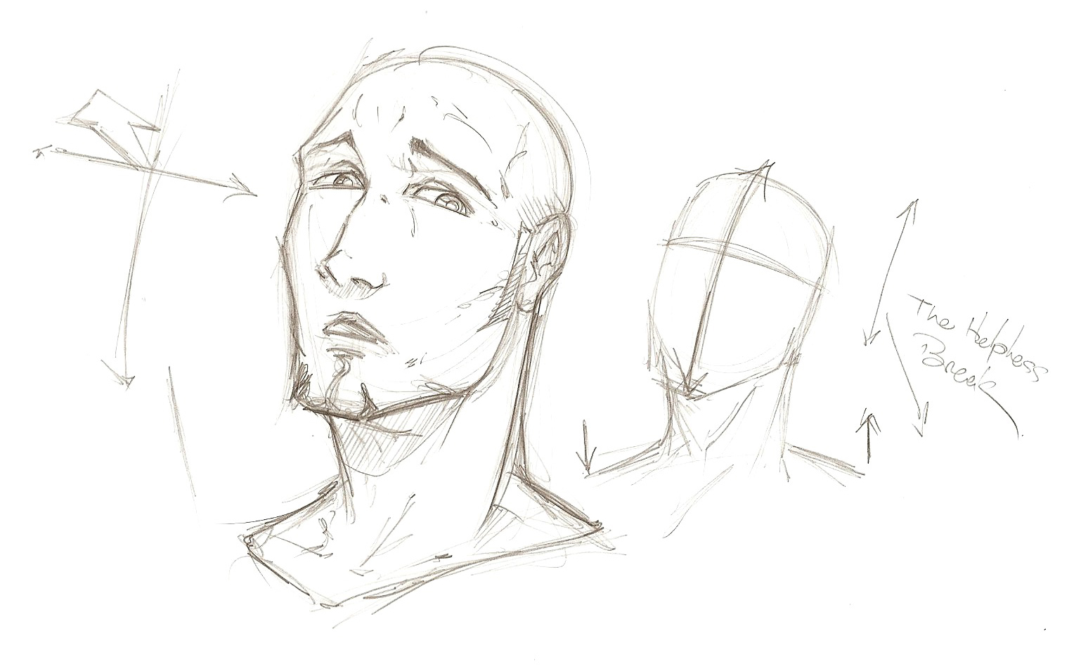
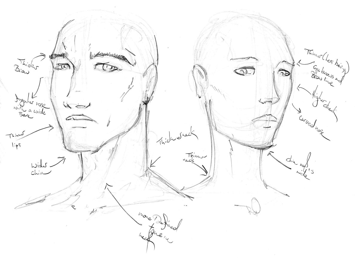
Below is an image of basic structured head of a man and a woman, common/ heroic figure type. Maybe in another tutorial I will address differing body/ face types but I am also still about these also.
Male:
Brow- Thicker build and muscling, thicker eyebrows
Eyes- Generally smaller and and can be more sunken
Nose- More angular toward crest/bridge of skull, wider at nostrils
Lips- overall thinner and can be less defined on the bottom lip
Chin- Wider and flatter than a woman’s
Neck- Larger muscle groupings and the Traps are anchored higher on the vertebrae
Overall- Representative of strength due to angles
Female:
Brow- less muscling and thinner eyebrows
Eyes- generally larger with longer & thicker eyelashes (great for illustrating!)
Nose- Overall more of a smooth slope than men’s
Lips- Fuller with easily defined edges. Can be very expressive. Their fullness can be expressed with reflections/sheen
Chin- Thinner and tapers more to a point. Jawline also curves out more and that ads to the gently roundness of the structure.
Neck- Less muscling causing it to be thinner overall. Additionally, the Traps are not as thick and give the appearance of anchoring lower to the spine. These features can have the neck “look” longer when it is technically the same length next to a man’s.
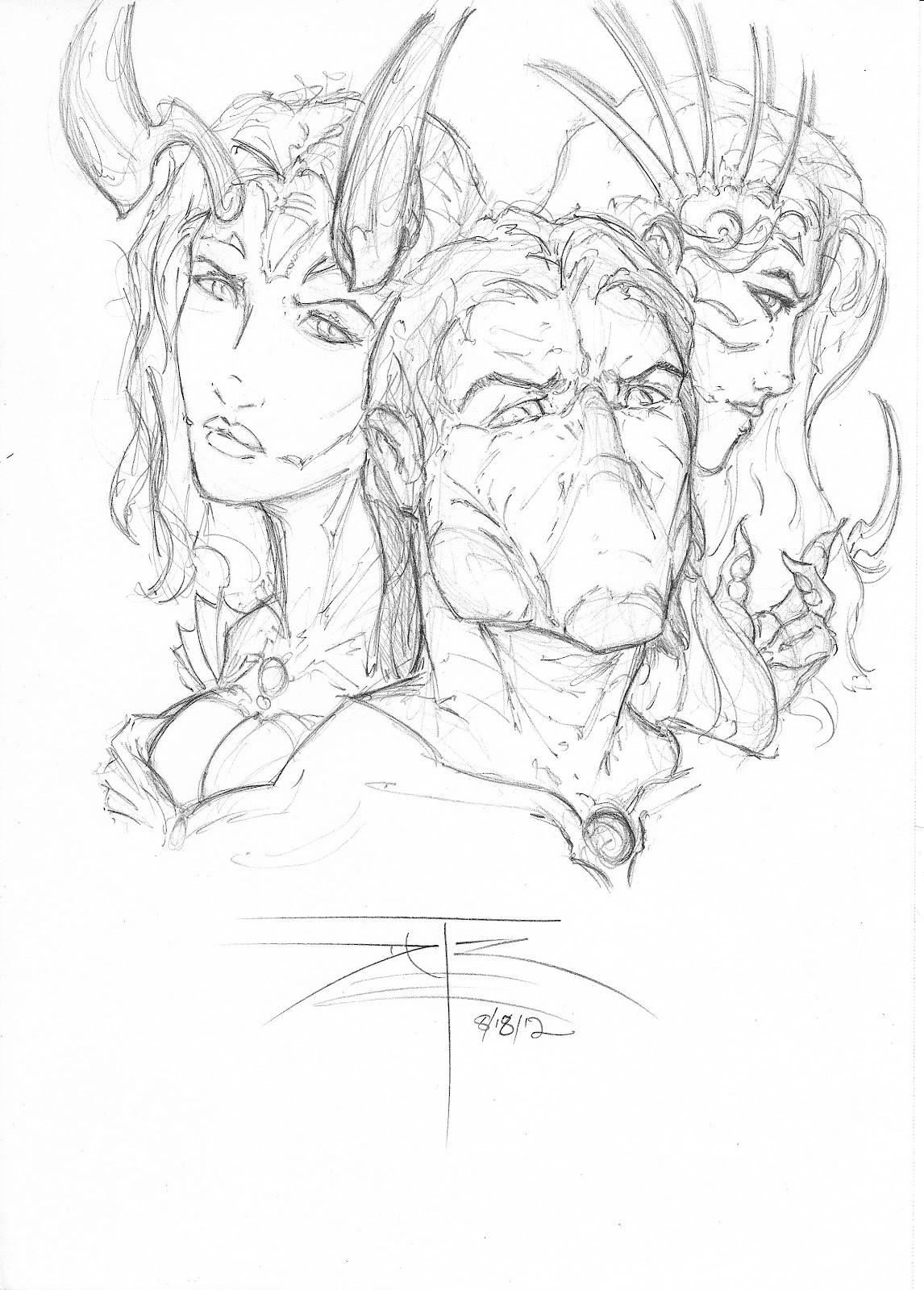
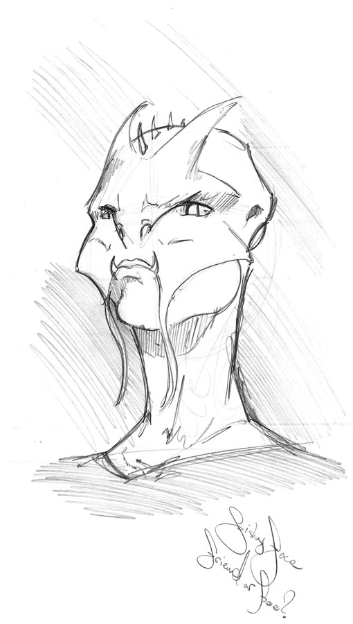
Fishyface: The Oyster Eater!
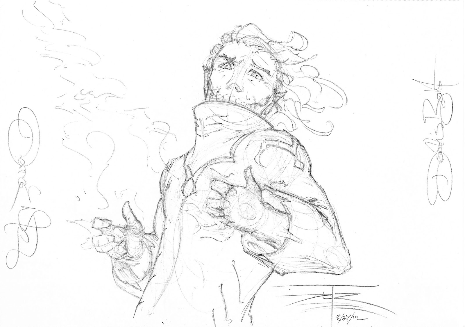
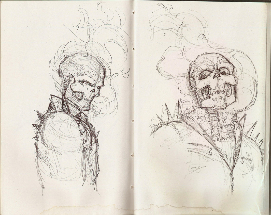
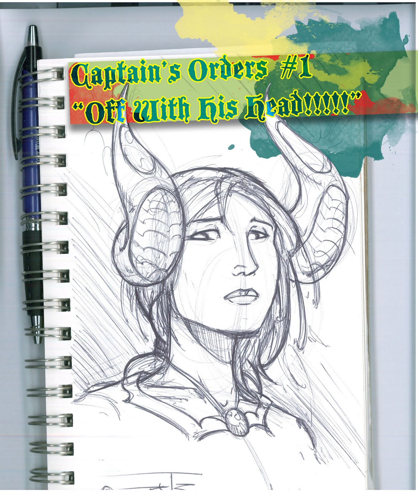
Monsters and Beasts!:
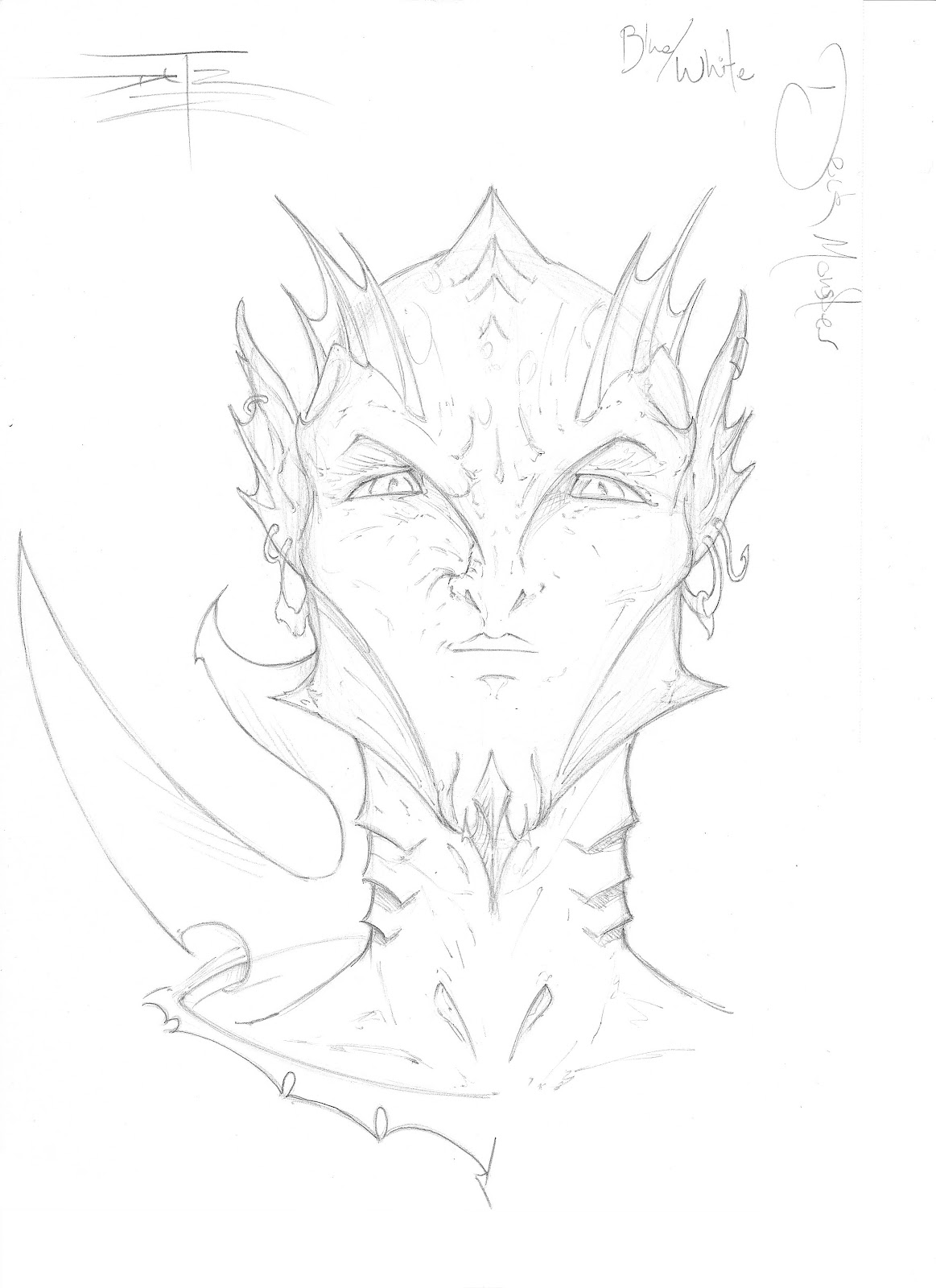
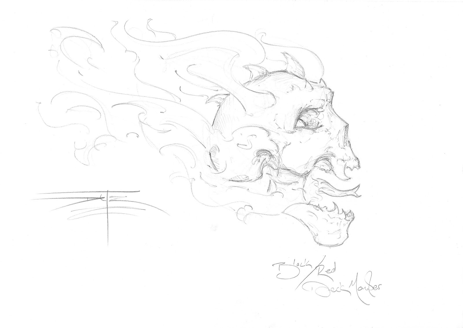
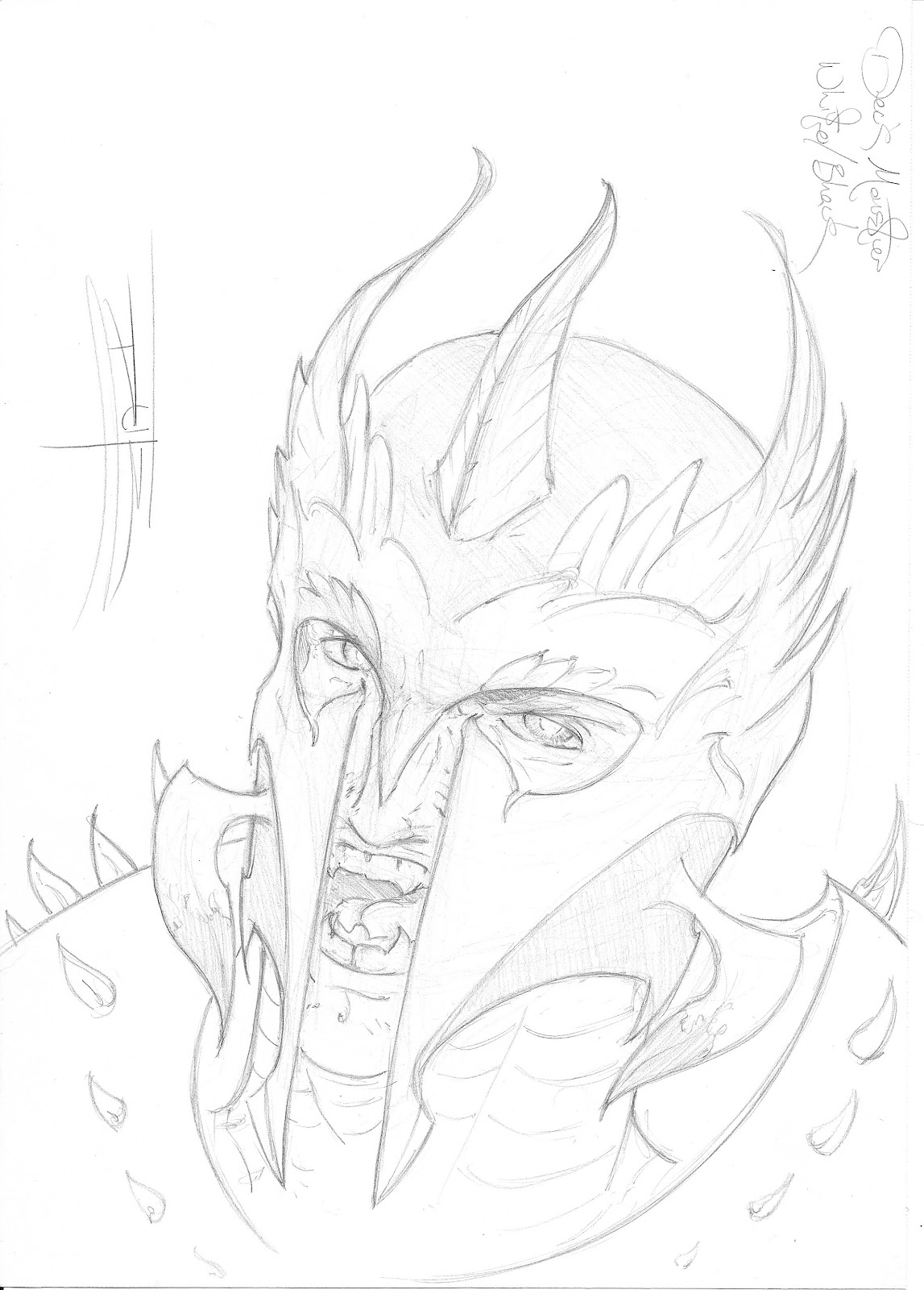
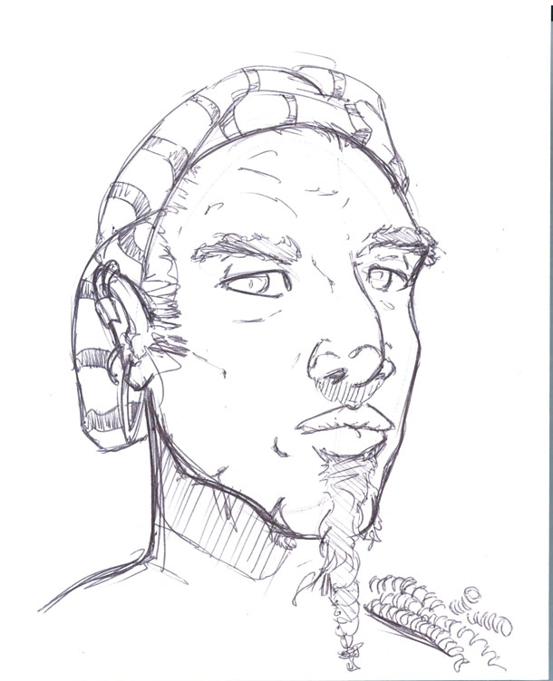
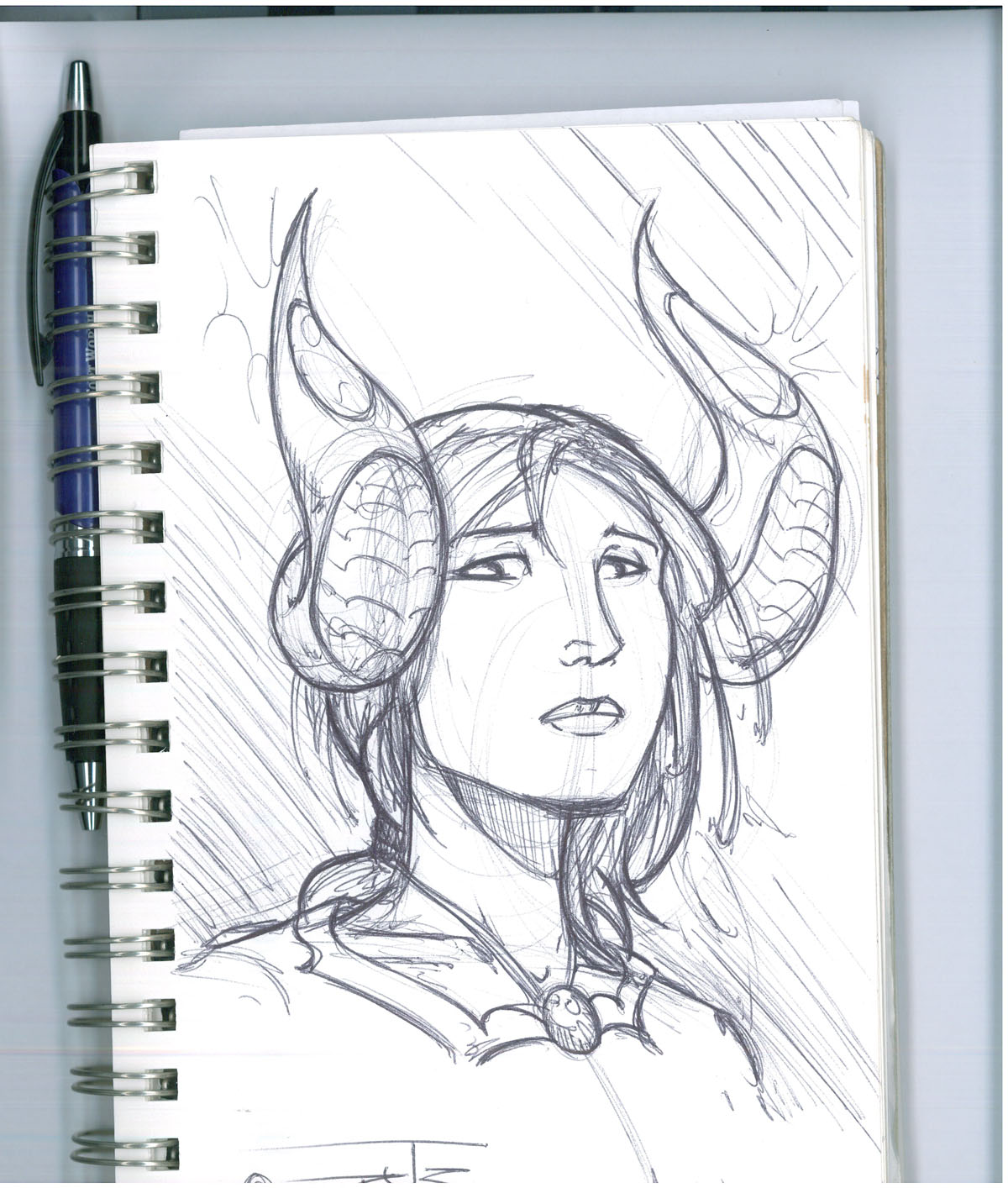
Take the same structure and shift/adjust the placement or emphasis of the features. This works if you want the creature to resemble a more human physiology. This is important if you want the human characters to relate to them on the same level. Adding more animal characteristics take them further away and is a great way of creating a gap of common ground. With more distance between your characters in appearance you can create more tension or opportunities to learn from each other depending on the station/archetype you want them to represent.
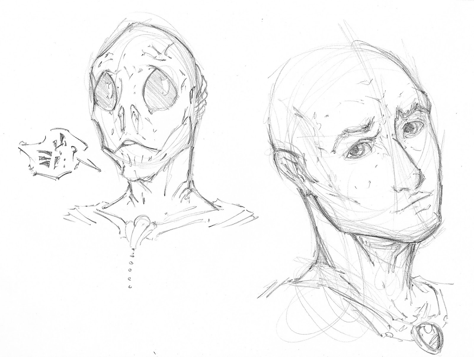
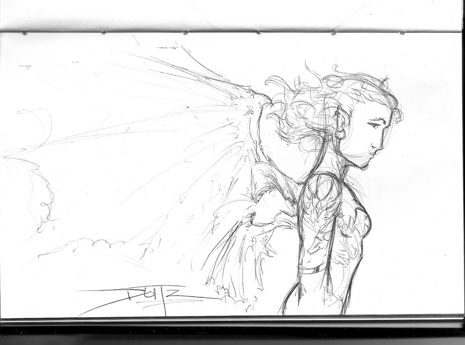
Here are two sketches representing more developed features listed above for men and women.
The man is shown with the features of an African American and the female is actually one of my versions of the Angelus from Top Cow Procuctions, one of my favorite comic companies. More on them in another post!
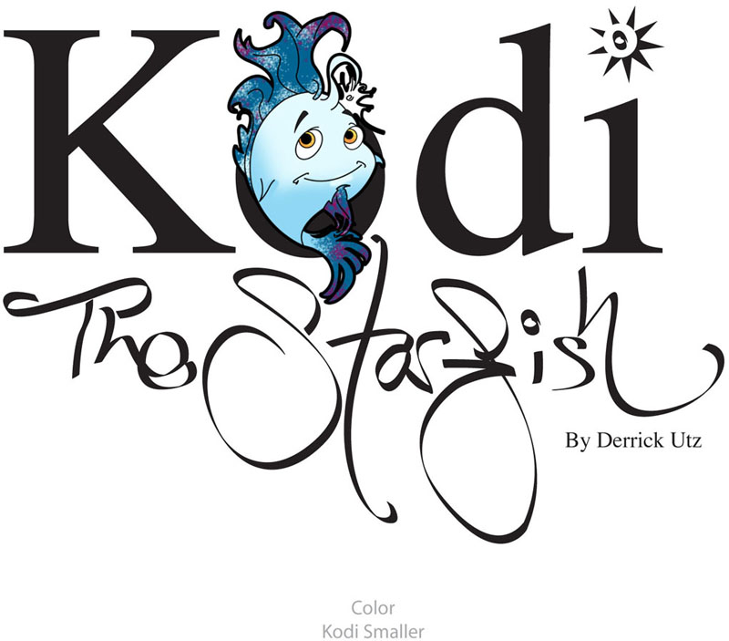
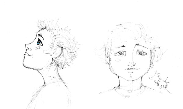
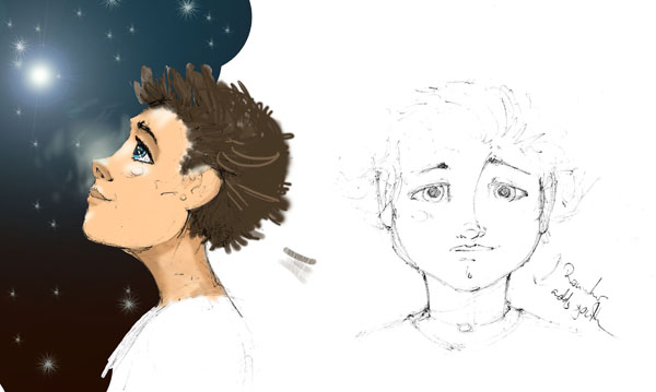
I have also attached a sketch of a child’s face. This is a concept piece for one of the children’s stories I am developing, Kodi the Starfish, mentioned in more detail below in my “Current Project List.”
 I will make another post in the future detailing their changes in physical structure for children in the future. I would like you to lock in this lesson’s information first.
WHEW!!!!
That was awesome! Thank you for sailing through it with me! Now that we are finished with the lesson I want to let you in on the secrets of my current projects!


Current Project List
I have been pretty busy with new art lately and I want to inform you of the progress. 

Comic
First, the biggest project I have in wait is a comic that is being developed for a submission to Image and Dark Horse Comics. I would be the penciler for the project. The writer is still developing the breakdown of the chapters and from the looks of it, it will be about 10 issues. I have finished character concept art, 16 interior pages and 2 covers. I will post a few pieces when I get approval from the writer and this section of the post will be updated.
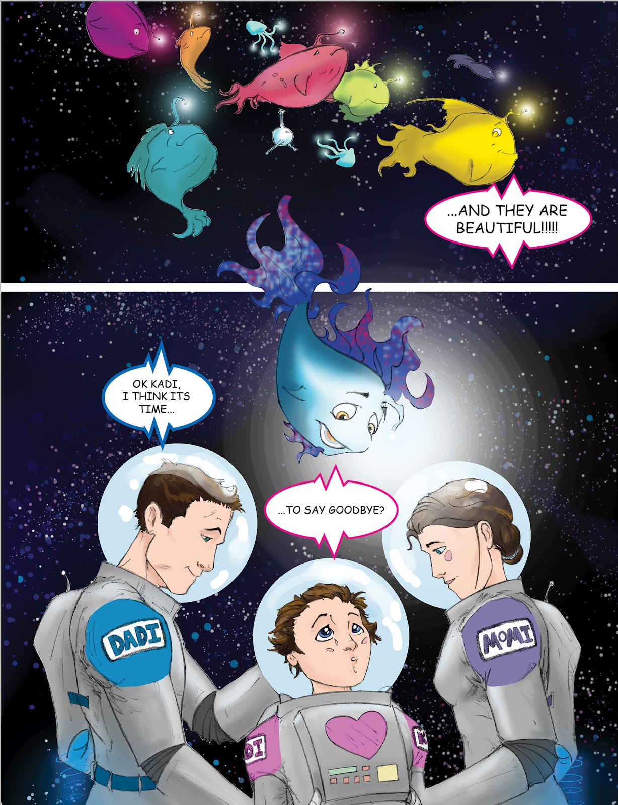
Children’s Book
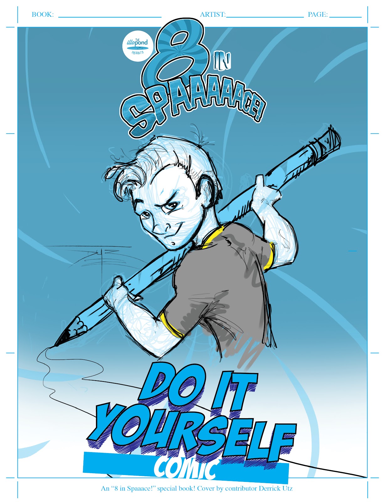
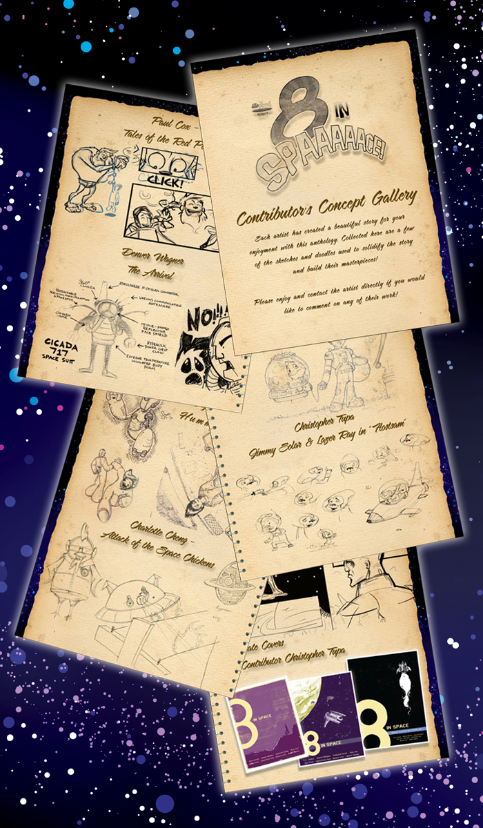
The other major project on my table is for an anthology with the awesome community at Illopond.com! They are an artist project and support community and creating anthologies is one thing they are known for. They have been kind enough to allow me to participate in their latest edition, “
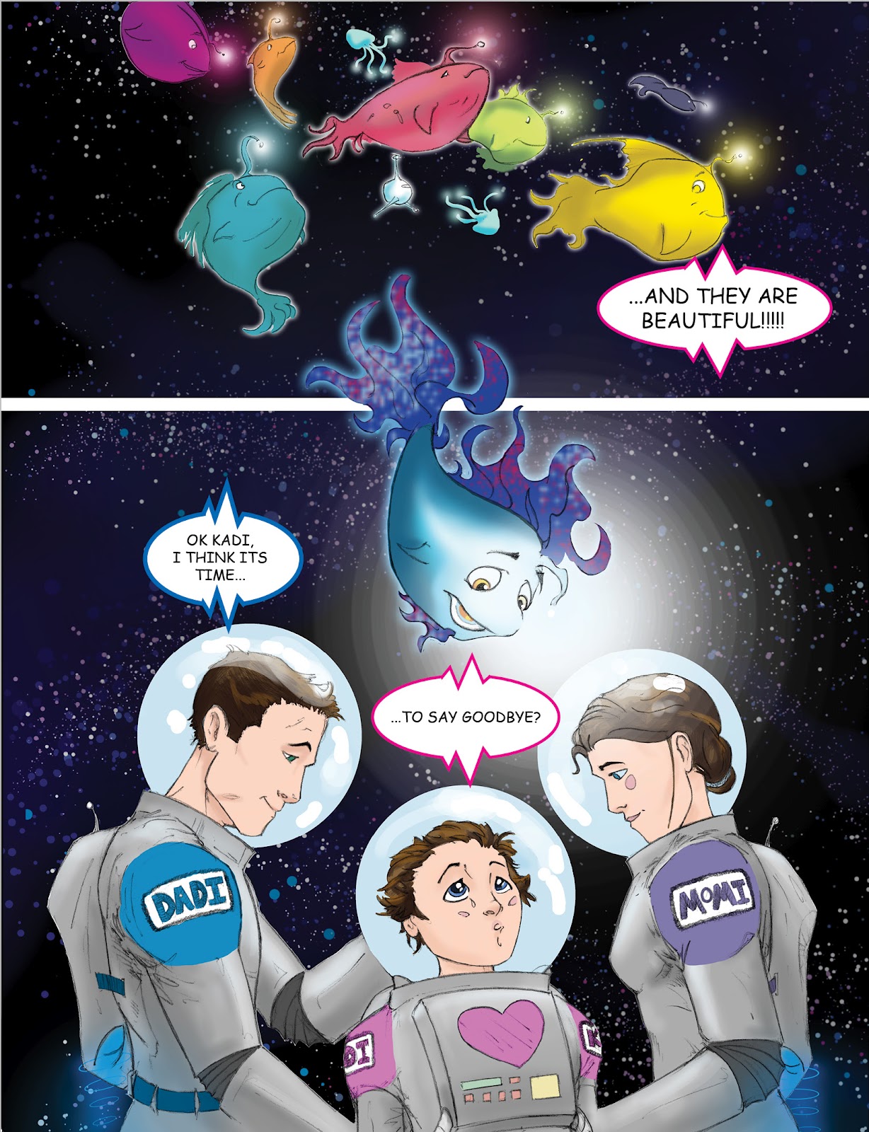
8 in Spaaaaace!” 8 main contributors and multiple others will all participate in creating content and I will notify you as to my progress and art as it happens. I will make a special “Captain’s BLOG” post soon about the art and story of Kodi the Starfish, my story. Here is a color sample of a concept piece below.
Alllllgrighty ya scurvy bags a’ bones!!!
I think I have tortured ye enough and bid thee fair well!
Please let me know if you have any questions and post a comment if you’d like!
Thank you for dropping by and best wishes to you. I am working on having a regular, bi-weekly schedule for every other Monday. I will also just drop sketches randomly so keep your aye’s peeled!
See you on Monday, November 7th!
Captain Dutz