![]() |
| Trust me, when you see whats going on here you’ll freak! |
BLOG!
Captain's Rant #12 – Updates & Plunder'n the Open Seas!
Captain's Blog #12 – Portfolio, Publishing, Partnering, Oh My!!!
Ahoy Shipmates, Crew and Visitors!!! It seems like its been a longs time since I touched shore…oh yeah, it has!! Sorry! Its just been crazy here on the boat and and below are a few reasons why!!!
My newly finished portfolio is now added to the site! I call it “The Collective” because is my geeky way of saying my collection. Just cruise up to the top right of the page and click on the image marked “View My Portfolio!” Looks like this image — > ! It will take you to the newly added page with my portfolio for you to check out!! It has been a long time coming I am immensely relieved that it is finished enough to show you! As it is ever growing and changing, I will be making adjustments and I will keep you in the loop!
Wow!!! The first “8 in Space!” book is finally in print! This is a first in many ways for me. First anthology contribution, time being published big time and the debut of my first major children’s book character, Kodi the Starfish! In this 86 page book we have every think from the discover of Bigfoot on Mars to Space Chickens and Alien Invasions. There is also a do it yourself comic section for the kids with a cover drawn by your very own Captian! The digital book can be purchased through Paul Caggegi’s e-store page here for the awesome price of $2.99!! More awesome space stories to come with the second volume of which I am lead on, “8 in Spaaace #2: The Gemini Project“
And last but definitely not least on the recent list of the Captain’s crazies, I am now one of the founding members and an administrator for a new anthology production team, Anthology8!!!! This site was started by a great comics creator, guru and the project lead from the formerly mentioned “8 in Space” book, Paul Cageggi. He initiated the site in conjunction with myself and a short list of other awesome creators such as Mark Harmon, Paul Cox and Sam Kirkman with one main goal; to create awesome anthologies that we can all be proud of and sell to the public at mass! We are still in the building phases of the site and still burning through the deeper details of the functionality and features of it but for the most part, it is up and running for visitors to lay their eyes on and watch the progress as we create out products to sell and share with the world! I have also been honored by being asked to be a guest blogger on the site to share my ideas and strategies to the team and visitors. This is a very exciting place to be and I will write the first post soon and keep you all in the loop! Until then…
Captain's Rant #11 – My Artistic Growth Equation!!!!
Until then,
Captain's Blog #11 – "The Mighty Mini!" Tips for Creating a Great "Short" Story!
![]() |
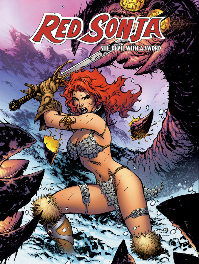
| Red Sonja comic cover illustrated by Jim Lee! |
…And here is why. Above is a cover to a full comic but its art is a great example of how even a single image can tell a great story. You can tell the setting, what kind of person is involved in the story ( and how little she is concerned about her surroundings by the way she is dressed ) and the intensity of the events contained in the comic. That is a lot of story for just one full page piece of art but this is what it means to tell great stories visually. In all of this, we as visual storytellers, would do best to create work with just as much clarity, intensity and catch as images like this but there is more to it than just pretty pictures.
Following in the footsteps of a great recent podcast from one of my favorite communities, PaperWingsPodcast.com, I would like to help strengthen the content of one of our underused and most powerful creative tools, the short story. This is an important topic because as the frontier of our creative industry changes, “projects are becoming the new portfolio” as this podcast’s experienced hosts Chris Oatley and Lora Innes remind us. This is because “projects” are real-world applications of the creator’s skill sets and that is a big step beyond just showpieces.
Also, I am contributing member and project lead in another awesome community called Illopond.com. I am additionally writing this to help its members and my project’s team with a few points to consider as they plan, write, illustrate, color and letter their own short stories that then get collected and published in anthologies! It is a really fun and engaging experience and I would suggest that many more artist take on such a task!
Onward to today’s tips!
Note: Though I believe these tips are important to all short stories in many ways, they may not apply to yours. Only use what you feel helps your story communicate to the audience and do not stress the others. I am a creator that loves epic and intense stories and art so a few of these tips may be grander than you need.
What makes these examples so special? They were a total of less than 15 minutes and yet you were touched and engaged because the content was powerful/meaningful and the delivery was well done and clear. Read on to see how these goals and more should be what we are striving for with our stories.
Short Story Tip #1:”Carpe Momentum!” -Seize the Moment-
Create stories that focus on a single moment, event or situation. Like an episode on TV, you can have pieces of a larger story stand on their own in this way. I refer back to the Paper Wings video episode, “How To Lose A Fan In Ten Seconds: The Flaws Of A Comic-Con Pitch” by Chris Oatley, to re-enforce this point. Chris discussed the need to find the “universal human emotion” to discover and communicate the greatest basic theme in a story. This same practice is of the utmost importance when approaching a short story because you need to connect to the audience with that same message in less pages and time. Identify the UHE (universal human emotion) and its theme. This is where the power of a tale rests. Then speak directly to it and you can be more effective in less space while still making a great impact.
Short Story Tip #2: Clarity!
Your short stories must have a clear and concise set of information and happenings to be easily consumed in a shorter amount of time. Even if your tale is a story of mystery, the pieces and their presence needs to be clear by the end of the story. This tip affects both the story and art aspects of the final product. In storytelling of almost any kind, there needs to be an efficiency. You will see this in very well directed movies where some random item may get a few seconds of screen time or a shot is filmed from a very specific angle. You may not even realize its being done. Then later, when that information is needed, you realize how it was introduced and now, why. The same goes with a badly told story in that the important information is not focused on enough, at all or even worse when it is a small part of everything being thrown at the audience. Clarity is key and confusion does not equal mystery. Be clear and intentional when providing plot and information to your audience. I believe it helps them enjoy the story that much more.
This leads right into the next tip which is…
Short Story Tip #3: Be VISUAL, Storyteller!
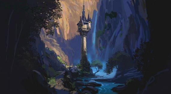
We are not writing in novels here so this is where things get artsy-fartsy. As a visual storyteller you get to let your art do part of the work for you! Let it encourage or even propel the setting, mood and characters of your story. Look back at the opening of this post. Jim Lee knew the content and goals of the story and used it to communicate a great deal on the cover. No dialog, just a picture. Let every page of your comic or children’s book speak in the same visual language. If your setting is a major driving force in your tale, get it right and do it boldly! If that setting changes during the in-story events, ensure that it is enough of a difference that the audience sees and feels it. Below is an example of how this setting information is used in Disney’s “Tangled” film with the lighting of Rapunzel’s tower. In the beginning the tower is bathed in a place of light and wildly varying colors. Then, as the story takes a darker turn, the colors take a dive toward the grays and flatter tones and that helps the audience feel uneasy and unsure.
![]() |
| Tangled’s Tower durring the day |
![]() |
| Tangled’s tower at night |
I know we artists and creators acknowledge this in our work, but not usually until the end for me so this tip is to help remind me too. If you plan for these kinds of effects and information in the beginning, then you can apply the thought process more smoothly during the creation stage and it will be more streamlined in the end ( and seem less like an afterthought ). You can apply this information to every aspect of your tale and the characters that experience it.
Short Story Tip #4: Leave them Satisfied
A small meal can still be filling. My goal with a short story is for it to be hearty. Chalked full of the ingredients that make it fast, great and good for you without all of the unneeded volume. Trim the fat and give your reader a entree. Even if it is not a 7 course meal it can still be satisfying and it’s ok to leave them wanting more. It just means you’re a good chef!
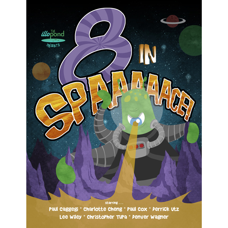
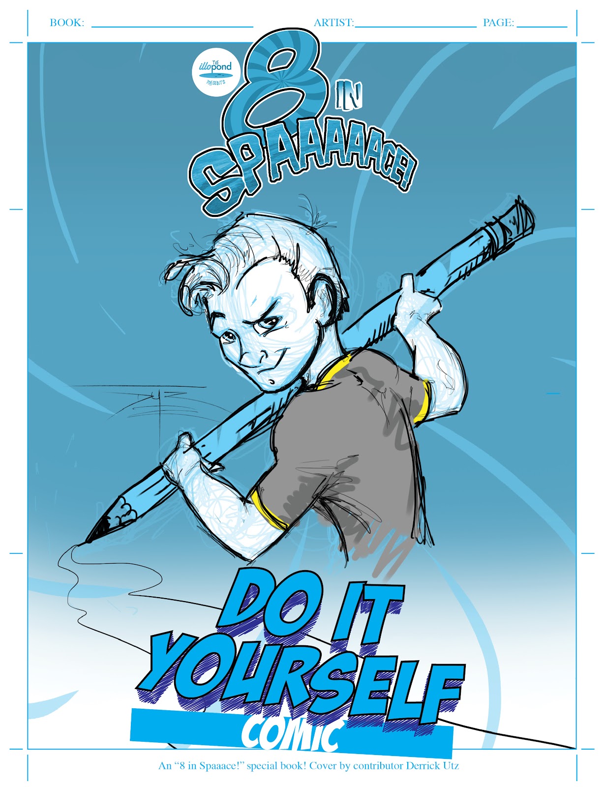
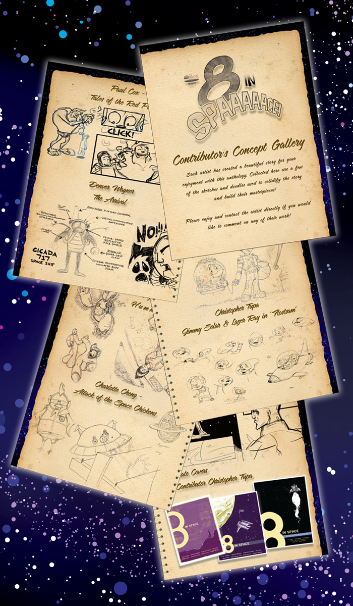
Food commentary aside ( cuz its making me hungry! ), this is probably one of the most important parts of telling short stories. Leave them satisfied. I have been learning a great deal as I am currently facing this lesson early on with my story, Kodi the Starfish. His tale debuted in the first space-themed anthology from The Illopond and I am currently working on Kodi’s second short tale for their second space anthology, “8 in Spaaace #2: The Gemini Project”, of which I am the lead. I was recently faced with awesome, thought-provoking questions from a fellow illopond member, Sam Kirkman that I just didn’t know how to answer. I really had a to buckle down and learn from him and my circle of trust about what it means to create great short stories and what I was missing was proper ending.
You character’s story will not end with your short story ( unless he dies of course ), but your audience must be comfortable with walking away from it where you left them. That is what I had to learn and what ties into tip #1; whatever situation, event or moment you introduced is what your audience will look for a solution to. Even if it ends with them hanging on a cliff ( see what I did there, HA! ) and you lead the audience to where they can find out what happen, did you engage them enough to care? If you can answer that you may have a great short story on your hands!
In Closing,
I hope that these suggestions will better help you to structure and create your Mighty stories in a Mini fashion. I am still new at this myself and I will be using these lessons often too, but I really felt the need to share them. My goal is to help you all get to the next level in your creative growth as a storyteller and also as a member of an audience. Please feel free to comment or ask questions and lets work on improving these tips together!
This post is one of the first in a series on creating better content. The posts will build up to tips, both visual and storytelling, following me as I learn to create content that is EPIC. Soon we will discuss visual methods like framing a scene or panel and how its perspective, angle and negative space can speak volumes into what is happening to the the characters. I will pass on the knowledge I gain as I study and learn from the amazing and mighty epic art and stories around us. Until then…
May the winds be at your backs and friends be at your sides. Blessed be your journeys.
Captain's Blog #10 – Update of "8 in Spaaace! Anthology and my extra contributions!
WOW! It has been insane here on the boat as of late!! I have been mostly anchored down with major work projects due to a large trade show that we had a ton of work for and I just returned from there a few days ago. On the Captain’s personal project side, the first Space-themed anthology out of Illopond.com‘s community of artists is now off to the printer’s!!!
It was a blast to work with the other amazing artists in this series and I look forward to many new projects with them in the future! For now, we are working on setting up promotional material and collateral so we can hit the ground running as soon as the first prints are available!
Just for fun, I wanted to post some of the additional art I helped with during the creation process of this anthology. I am very appreciative to Paul Cageggi of processdiary.com, the project lead, for letting me participate so heavily! You rock Paul and were a “blast” to work with!!!!
First is the cover to the special “Do It Yourself Comic” section. We have a lot of neat hopes and ideas that kids will take this section of the book and really enjoy creating their own awesome tale of Spaaace or any other fun comic they want! I had a lot of fun creating the cover art for this and stylized it after a true comic illustrator’s page. I also was thinking a great deal of my 6 year old son so the character resembles him heavily! He was quite excited about that!
Alrighty me Mateys, I think I will stop this post here and I will have more complete information in the next post about the purchase price and locations we are looking to use to distribute the anthology for all of you waiting so patiently!
Thank you all so very much for following along with the Captain for this first anthology/publishing adventure and I will keep you all in the loop with progress on the new Spaaace anthology book #2! I will be posting the books progress here and Kodi’s story entry progress on his new blog, kodithestarfish.blogspot.com. The first layouts of the 8 pages are already posted there so go take a look!
Captain's Blog #9 – April Sketch Dump!
Avast me Matey’s!
Here is a quick dive into the Captain’s current world with a new sketch dump and a listing of current project progress!
Sketches!
Here are some regular sketches compiled from either my little travel pad all the way to my legal pad for notes! I don’t care what i draw on some times, as long as I get it out of my system! Ha ha!
Now this is new. I have been considering for a long time about going mostly digital in my illustration process. It is a huge time saver and it is easier to to fix mistakes and transition into the coloring stage directly afterward. My awesome wife also thinks that I will be successful at this style of illustrating and she knows my weaknesses so that is encouraging. This is also the same process that one of my favorite web comic artists, Lora Innes, uses and her work speaks for itself. So, to test out the process, I made the following two drawings in a two day period. Both were drawn straight into photoshop without starting on paper first. After working these digital sketches, I too feel that this would work for a great direction to take Kodi that still expresses my style but does so in a more modern and faster way.
Project stuff!
1. ) Kodi the Starfish contribution to Illopond.com’s Spaaace book #2
This is the second showing of Kodi following his debut in the first “8 in Spaaace” book from Illopond. I have now worked up the first layouts for the 8 page contribution to the anthology and those have been posted to Kodi’s new art and story blog at kodithestarfish.blogspot.com so visit and take a look! They will undergo a bunch of changes in process from those layouts to the final production but I really enjoy showing people to process. Here is the thread to the whole project and here is Kodi’s thread there too.
2. ) Secret Comic Submission
My writer and I are very close to sending off the top secret, awesomeness submission of comic-dom!! Only time and timing will tell if it gets to go through a publisher and on to the comic book stands for you excellent visitors to seek and buy…but I will let you know if/when that happens! Exciting stuff!
Alright my friends and visitors, stay safe and keep being amazing! Till the next visit of the Captain’s Blog,
Captain's Orders #2 – "Waisted!"
I am finally getting back to me regularly scheduled Cap’n’s BLOG’n and here is the latest installment of the “Captain Order’s” tutorial series, titled “Waisted”!
This will be a brief description of how to use elements of the body from the waist up to to really create impact in your comics and illustrations. When restricting the elements like this and leaving out the legs and lower torso, you really have to learn to focus the power in a new way. As is common with my tutorials, I will show the basic structure of the body in the way that I normally build the frame, then I will add in other elements to show the more texture and finishing extras that can help to emphasis the characters motion and stature. I will explain this in more detail below. When finished with the tutorial, I will have a finished illustration from my very first post that shows this very information put to use in a fully penciled and lightly photoshopped manner.
Element #1 – “All in the arch”
One of most important element of any character illustration; human, alien, monster or animal is the overall shape that character take in each image. This is where the lessons of amazing artists like Chris Oatley are so important. You must establish a proper structure in the very beginning to have everything else connect to. when done right, the art will feel well connected, when done wrong your audience will always feel a level of discomfort because something in the structure is not right.
This is why the shape of the back and ribcage is so important. It is one of the most basic structures in the body and eventually almost everything in the body connects back to it. This is where we as artist have a real level of control and can create great moments of impact. #1 – When you settle the figure in a strong, straight upward pose it automatically establishes the characters attitude as stable for the moment (or conniving with a change in the facial expression). #2 – Also, when saddened, a character generally rolls over onto itself making itself smaller to express its emotion. #3 – Then, we have a character that desires to intimidate and pound an enemy and for one like this, his chest is opened wide and back is fully arched backward to make himself larger and give him the positions to strike with.
Each is show below missing arms so that you can see how just the torso and head can begin to establish these emotions and states of mind.
Element #2 – “Up in arms!”
Simple step, add the arms in different positions to help further the character’s visual statement. You need to ensure that the arms are still conveying the same emotion as the torso, otherwise the body is confusing its purpose and then the audience. Hint: Never give your audience an opportunity for unintentional confusion. I will separate them from the reading experience and then away from your story. Also, confusion is a powerful emotion and can be very useful in your story when used on purpose!
Element #3 – “U talk’n ta’ me?!”
Use the head in as many gestures as reasonable. It is a great way to add the character’s personality (cuz we probably all know someone whose neck movements do half the talking for them) and it is an awesome way to give a character a neat quirk too. A simple head tilt can convey intrigue or confusion. Also, if the head is turned in a different way than the body you can use this to help direct the reader to an area of the page or to specific information. We as artists need to use every tool at our disposal to aid the reader in following and understanding the story. And unlike a novel, we can use images wisely to direct the reader without words.
Extra note – The triangular torso
There are many times that I only want or have time to make waist-up illustrations but I still want them to look and feel finished. To do this I angle off the drawing with either interesting clothing or shapely cuts to end the muscle groups at a clean stopping point. I like to do this by using the natural shapes of the body. In the case of humans, we can cut the shape like an upside-down triangle leaving the lower point at the base of the torso and having the two side off of that point travel along the abs and obliques to the hips. This helps to make clean lines and to slenderize the figure at the same time.
Finisher – The Winged Artist
As promised, below is a finished image I created around July of last year. It was made for the first art contest of Paper Wings Podcast and it uses these very techniques that I mention in this post. Here is the link to the post with this drawing in it. It was the very first Captain’s BLOG post ever!!!!
Captain's Blog #8 – Debut – Kodi Gets a Blog!!!!!
![]() |
| The new header art of Kodi’s Blog – kodithestarfish.blogspot.com |
Just a quick note about the new things happening around here on the Captain’s Ship!! Our little friend Kodi the Starfish has had so much activity going on that I have decided to give him his own space!!! ( Ha Ha! Yes, pun intended! )
Kodi now has a new blog that I have designed and will be posting art and story updates to with additional fun content for all of his fans! I am very proud to have been able to help get him this far and I look forward to his growth over there as we continue to grow here on the ship with Kodi and one of our new guiding stars in the sky.
Captain's Blog #7 – The Captain at Career Day!
I just wanted to make a quick post about a recent first experience and awesome time I had at my son’s school for Career Day! The school sent out requests to parents to see if they would come do presentations or if they knew of anyone who could. I, being a graphic designer full time and an illustrator in freelance, thought it would be an awesome opportunity to share with others my love of this industry.
I was able to sign up for 3 classes worth of students which worked out to total about 75-90 total kiddos and they were a blast! They had lots of great questions and excellent responses! I was very impressed with them and was honored to go speak. I just wanted to show them that being a professional artist is a reality and that it is an industry you can fall in love with and really enjoy daily.
I put together a presentation and I have a large portion of it here (separated into different images) for you to view if you would like. Please know, I pulled a large about of images from general google searches and I do not own most of these as they were being used for educational purposes. I only created the first few pages, section introductions and the overall layout of how everything was presented If you click on the first image the interface should pop up and allow you to click through the presentation one image at a time, enjoy!!
Please let me know if you have any questions and best wishes to ya!! Now that I am getting back on track, I will be back on soon with my latest tutorial; “Waist’ed”. An instruction on how to draw some of the dynamics of a waist up character image!
Please let me know if you have any questions or comments on this post and best be to ya!!!


