BLOG!

Custom Logo for Dirt Addiction Race Team!

Ahoy me Heartys!!! Logo Art!!!!

Just a quick post here about a new project that was recently finished. I have a good friend named Jonathan Capps who is, amongst many things, one of the lead drivers and organizers of a local dirt track race team called “Dirt Addiction Motorsports”. I have become the resident designer for many of his projects and I recently created the team logo for his and his teammates cars! He requested a skull and cross-bone design using a race helmet that he wears and I went to town on it!!!

This was a blast and Jonathan has always been a great partner to work with. Soon I may be helping him with a blog site like this one so I will let you all know how that goes and link it here when it is finished!

Thank you all for visiting and I will be posting a new update tomorrow with a “state of the union” for my current projects to give you all a much needed update.

Below are some images of the art for the logo and the finished print on his car on race day!

Till then, best be to ya,
Captain Dutz

"Indie-Man's Toolkit" Page!

 Ahoy Invitees!!!


For the most part, everyone here is on this list because I have worked with you on projects or you are creative friends that I have met through different adventures in my life.

Well, I would like to officially invite you to this little discussion group i have put together to see if you all could help me to develop a tool. I come from an illustration background and am mostly a penciler. I have tried a few times to develop my own comics or stories and have fallen short of glory in my attempts. Many times because I did NOT put the PROPER work into developing the story and characters. I have a great friend and writer, Devon, that tried years ago to help me understand character building and I honestly shut down at the thought of the inner workings of the character’s story. I learned a lot from that situation including my weaknesses and what I need to work on.

Over the last year or so I began a new story called Kodi the Starfish. It is meant to be a mostly all ages story set in outer space. The content and theme of this story has brought me great excitement but now that I stand at the end of my known universe (my limited skill sets) and look out at the vast space around me, I feel that sinking feeling again and have come to a realization…I need some new tools!

Following that realization, I thought this would be great opportunity to engage the communities of experienced artists that I have connected with over the years. I look to learn from your successes and failures and cut my learning curve down dramatically and help us all in the end. I have now started to build my new “Toolkit” and have begun this closed discussion group to better adjust the tools. My goal is to create a product that can aid the “writer challenged” to capture, organize and then harness our ideas properly to create great stories. Then, we can do what we do best, take the written work and create awesome art from it to make our own comics and books!!

As of yet, when I am finished I look to have this be a free tool to send to you all and have available for download. I am simply trying to create a solution to my writing weaknesses that can help me annotate and organize the story. This will not replace the crafting of good ideas, only the practical organization of story and visual development that needs to happen before a comic can really hit the ground running with a solid foundation to fuel it.

If you would like to be part of the community that helps to hammer these ideas together and boil them down to their simplest forms, I would be very honored to have you. I already have some sheets developed that will work great as starters to the project. Please let me know if you have any questions and I will try to explain things as well as I can.

Currently here is the idea of schedule.

Week 1 – (this coming week) Introduction and goal setting.
Week 2 – The Writing capture stage. I wanting to make sure that I hit all of the basics of story writing; synopsis, pitch, outline, theme and such.
Week 3 – Visual Development – character concepting, setting concepts, reference gathering, etc.
Week 4 – Production – This is where the regular penciling, coloring and lettering happens. I would LOVE to learn the different ways that you all are more efficient or different in your approaches to this area. I am mostly a penciler so I would really enjoy learning coloring and lettering trick.
Week 5 – Production (Print or Digital End Product Preparation) and Promotion – This is mainly a wrap up and strategy time to learn the best ways to notify the audience that the product exists and its best delivery methods.

In closing, I would like to take this week to get to know some of you more and understand where you are in your similar stages. In the end, my goal is to provide all of you with new information and a tool that will help you continue to be amazing while still keeping your creative sanity. If you feel that you know a few other artists that could help and be helped by this then please let me know. I am moderating this closed group and though I don’t want it to get too large to control, I do want to ensure that we are as well rounded as possible.

My best to you all and thank you for influencing me in the ways that you have.

Thank you all so very much,
Derrick “Captain Dutz” Utz 


Below are the first drafts of the pages!


1st Sketch Dump of 2013!!!

Ahoy Shipmates, Crew and Visitors!!!

Welcome to the first sketch dump of this awesome year! Thank you SO much for stopping by! I just have a few doodles to throw down and then will update you all on a few of the upcoming events in my creative endeavors. But first, onward to the art!!!!

Ok Crew, now on to some of the new tasks at hand. As you all know, I have been off line for a few months to take care of home, work and extra duties. I have been working on little things here and there but I have been continuing to keep my main goal of only having very few personal projects going on at once. I do not want to risk the quality of my work to overtaxing myself.

Well, in light of realigning my schedule, I have been looking back at my personal all-ages project, Kodi the Starfish, and trying to plan out my next steps. I was working with a small group of other artist to put together a new Space Anthology, but many of us became very busy with our own tasks and I still need to see where we all stand on that. I was lucky enough to get started with a few team members so I will try to catch you all up on that project as I learn more too.

I am very glad that my anthology entry is a second short story for Kodi because the work I have been doing can still be applied directly to the bigger story and project. As I have been getting back into the short story and considering the content of the larger, complete story, I realized that I have some preparation to do! As an illustrator, I never really learned to organize and craft ideas together as an astute writer would.

As I looked across the vast distance ahead of me, I came to the conclusion that I would need some tools. Following that realization, I thought this would be great to engage the communities of experienced artists that I have connected with to learn from their successes and failures and cut my learning curve down dramatically. I have now started to build my new “Toolkit” and will begin a closed discussion groups with my contacts to better adjust the tools. My goal is to create a product that can aid the “writer challenged” to capture, organize and then harness our ideas properly to create great stories. Then, we can do what we do best, take the written work and create awesome art from it to make our own comics and books!!

This is still in its infant stage but I will let you all in on some of the tools as they develop!!! Alright me Hearty’s, I will be developing new material and content soon to share with you all and I will update you here and on Kodi’s Blog as I progress!

Thank you all so very much for checking and for following along with the many crazed creative adventures on The Captain’s Blog!

Best be to yee’ me mateys!
May the winds be at your backs and friends be at your sides. Blessed be your journeys.
Captain Dutz

Chris Oately's Portfolio Party Page!

Ahoy Chris and the rest of the Portfolio Party animals!!

This is a special page created just so Chris and yourselves can jump on to see these special (some secret) pages from the comic penciling part of my portfolio!

Please let me know if you have any questions and enjoy!

And as always, thank you Chris for taking the time to look at this and review my work!
NOTE:
The art and story that you see on pieces 4-7 below are the sketch cover and and interior page set from a submission I was working on with a great writer/creator named Omar Villagomez. This project is mostly secret but we still wanted to share a little of it as a gift and to show my most recent penciled interior work.

So just click on the first page below and use your arrows to scan through! Enjoy!

Painted by professional digital painters.

Best be to yee!
Captain Dutz

"Building an Epic!" Part 2 – Negative Space!


Thor by Me!

Ahoy Shipmates, Crew and Visitors!!!
Welcome to the second installment in a short series of tutorials of an epic proportion!!!
Building an Epic! Part 2:
Negative Space!
Intro to this tutorial!:
    Hello!!! I am sorry it has taken so long to get to this new post but I am thrilled to finally write it!!! This was actually a difficult topic to research but I believe I have enough to really nail it home. Today I want to talk about negative space in comic and fantasy illustration. This is not the common negative space you see with a black and white image and it is simply a series of images that can be pulled from the silhouette of the subject. Instead, I am describing the compositional approach that uses different elements to draw attention to a single subject or action to create impact on an audience. The reason I approached this topic after the first Building an Epic Post about Scale is because it uses elements of scale in its execution. It is best to understand one before the other.
     Negative space to me is the use of the page, panel frame and content to create impact for one element in the scene. This could be used to create the feeling of the lone warrior, overwhelming odds or even to nail home an emotion like pride or anger.

     When used correctly, negative space is a tool that can help to connect your audience to your characters or their situations. As an example, below I have a video trailer for the upcoming movie, “Epic.” It uses a great combination of scale and negative space/framing to really nail home the vastness of the world and situations that the charters are faced with.
Video Example: 
Movie Trailer for “Epic.” Blow it up to full screen to get the real effect!
Visual Elements of Negative Space:
1 – Focal Point:
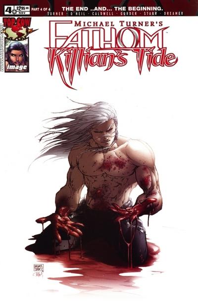
     One of the most important elements of this compositional tool is a single point of focus. This does not need to be one person or thing, it just means that is cannot have the focus spread all over the page or panel. The idea is to have your audience land on the panel and be driven to one point in it in the end. Then, that on point needs to convey a feeling or be connected to the rest of the scene. If it is just the subject and no other content then it is best to have the subject conveying the emotion or message you want to get across. One of my favorite examples of this is from the late Michael Turner and the cover he did for the Fathom: Killian’s Tide Series. He chose to have only the subject and no background so you, the audience, would only have him to focus on and you would feel alone with the character. This is one of my favorite pieces from an artist whom I loved and was constantly in awe of.
2 – Contrast & Framing:
     Foreground, Mid-ground, Background. To create a great negative space piece, use these to your advantage. Then add in elements of tone, texture and color to seal the deal. A strong method of achieving this is to use a variety of elements to create the separation of focal point and surroundings. This can be done with everything from the line weights in the illustrations (something I am still working on for myself) to the contrast of the background’s texture or color and the subject’s own. In many negative spaced pieces I see the foreground as the main stage of the focal point and much of the surroundings in the background. The mid ground can be left empty to create that visual gap that distances the two elements.
3 – Composition & Direction:
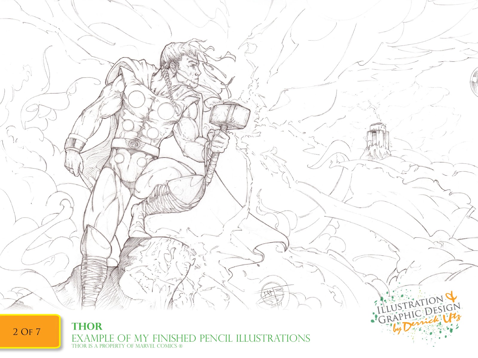
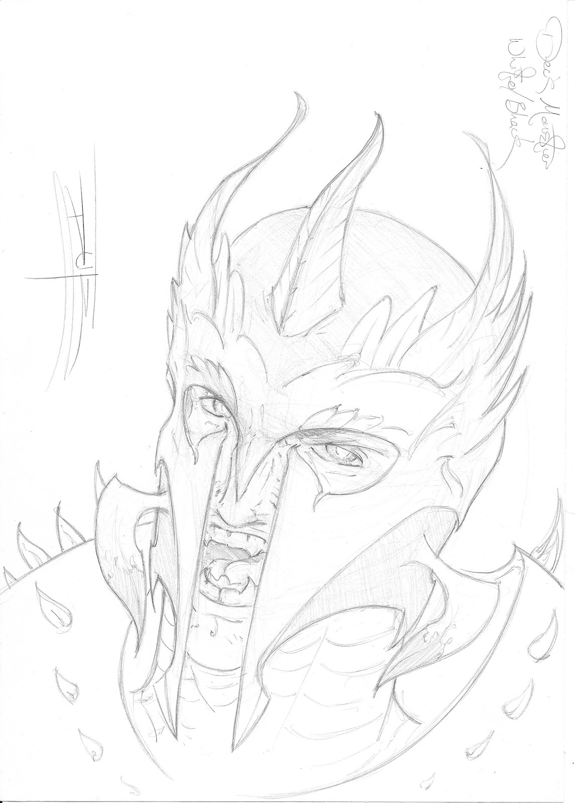
     Last in my list to discuss on the subject of negative space is the thought that goes behind it. It’s Composition. The best epic illustrations that I have come across in or out of comics were great because they were designed well. As the artist, you have the opportunity and ability to create an epic feeling piece on even a sketch if we create it with a high thought process and a direction for the reader/audience to follow. This is one of my favorite parts of creating epic art; I have the chance to tell a grand story with one piece or panel at a time. In respect to composition, it is best to create keeping in mind the ways that people “read” an image. Right to left, top to bottom. In art, your colors, implied lines and shapes create the readability of each piece. In the Thor illustration at the header of this page, I created this to be red right to left. I knew that with it’s frame, a wide-screen set-up, that the audience would read it along it’s longest axis. So, when you scan it you see our subject close enough to connect with him and then we reach his face. On it you see an expression that makes you wonder if he is protecting that cliff or launching an attack from it. Then as we “read” further we see a tall hall of Asgard in the distance. Thor has come home and it does not look like it is going to be a good visit!
     I wanted to have the piece understood in stages and additionally, I wanted the reader to be on the side of Thor. We share a visual space with him on his rock, in the foreground, and then we see him contemplating his goal in the distance. In understanding the greater goal of your composition, you can truly hit home with a message and its weight with well placed content and strong cues. 
Visual Scale In Action:
 Break-down:
Why this? – 
Frazetta was a master of many things and one was the use of negative visual space to add grandeur to a story. In this piece titled, “Conan the Adventurer,” he does a wonderful job of telling you so much about who Conan was. He was brutal, strong, in charge and unwavering in his vision of himself. We know this by his build, stance and how Frazetta balanced the piece with him in the center over a triangle-shaped mound (a triangle being one of the most stable shapes) and then anchoring the piece to the sword in the very center of the painting, beneath him and at the top of the mound. There is no doubt that he means business.
Closing:

     Thank you all for being patient with me as I got to this post and I hope you all learned something from it. I honestly did in the research for it. As with the last post, I want to close with thoughts on how this information can make your stories better. There are so many visual tools to use that it is hard to choose sometimes so I suggest this; if you want your audience to gasp as your character(s) come to face a single moment of realization or a powerful situation, consider the use of negative space to frame the message and compose it well. When you do, your readers will see your story through your protagonists eyes…or the eyes of their enemies, and you will create a strong connection to them. And of coarse, the more grand everything is to your protagonists, the more grand it is to your audience.
Remember, in their hearts is where the epic happens.
I will be back soon with part 3 of the series of the epic. I am still narrowing down it’s topic. Until then…
Best be to yee’ me mateys!
May the winds be at your backs and friends be at your sides. Blessed be your journeys.
Captain Dutz

Treat: Click the thumbnail below if you would like to see a high-rez version of the Thor header art.
Enjoy!

Deck Monsters Sketch Series!

                        Ahoy Shipmates, Crew and Visitors!!!

     WOW!! I cannot tell you how excited I am to finally get to post these pieces up! These are based on inspirations I have been having lately by playing Magic: The Gathering with some coworkers and friends. I have been playing for about two months and as with many things, it gets my artistic and creative gears going. So, I started pulling out an awesome sketchbook I go from Walmart and started going nuts! Each original drawing took between 15 and an hour depending which piece and then I got giddy on the computer. I went into Illustrator and created the title type solution and borders that I then took into Photoshop and combined with a scan of the cardboard back of the sketchbook. I then pulled the images of the Mana (elemental symbols at the bottom of the art) and added those with effects into Photoshop. I then went crazy adding color effects and lighting giving thought to the mood and attitude of each element type and creature. 
     This was a huge amount of fun and I would like to actually send this to the games creators just so they can see what kind of geekery they helped to inspire!!!
     I really hope you all have fun looking these over and please comment if you have any questions about the content or creation process or if you are a fan of the game too and have a suggestion for more Monsters. I have at least two more thumbed out but will hold off on those until I finish the second short story for Kodi the Starfish, my all-ages book series!!
Thank you all for visiting!!

Captain Dutz

Just click on the first image and use your arrow keys to watch the magic!


Sketch Dump for September '12!!

Ahoy Shipmates, Crew and Visitors!!!

Hello Everyone!! This is just a quick sketch dump to show you all what I have been whipping out of my new little sketchbook! Just a note: if you get the chance, run by Walmart and grab one of these puppies! I got a sketchbook called “ART1ST” brand “sketch dairy” for about $4 and it is 11×8.5″ and has 70 sheets. Great deal and good quality paper. I had forgotten how important it is to have a book at hand to capture visual ideas when they hit and man, have they been awesome!!!

So, on to the art!

And also I am excited to show the sketches below! These are the original drawings used to create a new sketch series I started called “Deck Monsters” based on inspirations from the Magic: The Gathering trading card game. One of my new posts titled “Deck Monsters Sketch Series!” has the finished versions of these drawings and shows how I used them. They turned out really awesome so read the post above this one to see the finished versions!!

Thank you all for visiting! More art for you soon! Until then…
Best be to yee’ me mateys!
May the winds be at your backs and friends be at your sides. Blessed be your journeys.
Captain Dutz


Kodi's Debut Book Review on Kodi's Blog!!!!!


Ahoy Shipmates, Crew and Visitors!!!

Hello All!!! I know it has been a long time since my last post and I do apologize. I have been running around handling a great deal of things on board here and I am planning to have many new treats to post for you by this Friday!

Buuuuuttttt…..
Until then, I have an awesome little quick post of a review of Kodi’s story in his debut in a spaced-themed anthology!

Click below if you want to see the beautifully printed story and original sketches that have been part of what has kept me so busy!

Enjoy and I will see you later this week! Until then…

Best be to yee’ me mateys!
May the winds be at your backs and friends be at your sides. Blessed be your journeys.
Captain Dutz

"Building an Epic!" Part 1 – Scale!

Ahoy Shipmates, Crew and Visitors!!!
Welcome to the first in a short series of tutorials of an epic proportion!!!
Building an Epic! Part 1:
Scale!
Intro to this tutorial!:
     Hello All!! Ok, first and foremost, welcome to my short tutorial series on building epic visual content for your art and stories. I am a huge fan of grand tales and I sit in amazement at how some creatives pull them off. For this first lesson I will pass on the knowledge I have gained from studying this type of story style so continue reading for fun tips! 
     

     I know that most of the artists reading this are capable and creative people. What I realized a long time ago for myself is though I am capable, I wasn’t equipped. I know how to draw an make awesome art but I wasn’t always aware of what pieces were missing or how to make it better. That is what made me study other successful pieces so often and it helped me to learn about the elements that come together to create real, grand impact. That is what this series is about; increasing your awareness of the pieces of epic art and how you can use them in your tall tales! Many great books, comics and movies have just the right mix of each of the topics of this series so I just want to give you ideas on how each piece can work for you!
    For this first post I will be discussing how the size of the obstacle can raise the stakes and why. Notice how I said obstacle and not just enemy. Yes, many great epic stories have mighty monsters to face ( I have an awesome video example of this further down the post), but I do also refer to the size of the tasks the charters face. By scale in this lesson, I mean the relative size of the conflict in comparison to the hero or heroes. 
    I first wanted to learn this for a comic I was starting for myself call “CloudMakers.” In my story humans had built huge, floating city-sized machines to protect the planet and the stories revolved around maintaining and shielding the machines from many enemies. I realized that I created something I had no idea how to draw. Guess you could say that I was a little over zealous. When I then began to design my new character and story, Kodi the Starfish, I put myself in the same situation. As I taught myself how to build these different elements I learned a few lessons on the way. Here they are below but first, a video example of scale in action!!

Video Example: 
Final Fantasy Advent Children – Cloud vs Bahamut

Visual Elements of Scale:
1 – Size:
     Obviously, when discussing things that are epic, size is absolutely one factor. The bigger the task, the greater the threat or potential failure. This is where the intensity of a story can really hit home. If you create an opportunity for the character’s failures to effect more than just themselves, you have created an opportunity for a hero’s drive and a chance for a great character to show it. That vacuum of risk and drive is one of the best methods of getting your audience cheering for your hero.
2 – Complexity:
     This is the balance to the monster who destroys the city. Sometimes the task is not a monster but a machine, or an organization. All of which are larger than your hero and will take more than a fight or two to take down. Complexity gives you the chance to create an obstacle with intelligence. Machines have creative design. Organizations have leaders, contingency plans and loyal, self-sacrificing members. With these opponents, how big your weapon is nor how hard you punch is of no consiquence. They are so far removed that “fear” is not a factor and to defeat them you must infect or disassemble their pieces. This can be an intense task for a hero especially if he is not equipped. A writer friend of mine, Omar, love to write stories with this kind of content. It makes him giddy to create opportunitues to thwart the hero with elements he was not expecting just to increase the difficulty. Something that cannot be done with a monster alone.
3 – Quantity:
    This is a pretty straight-forward concept but I wanted to get it down. With quantity you have the opportunity to overrun your characters to either destroy them or hinder their ability to finish needed tasks. Just think of the insane battle scenes from Lord of the Rings. Power in numbers has always been epic. 
Visual Scale In Action:

Break-down:
Why this? – 
In this example we see a combination of all three elements, Size in the ships, Complexity of the machinery and the overpowering feeling of the numbers. The artist does an amazing job of staging all of the content to allow you to “read it” invisibly. In the breakdown image I use rough blue lines which point out the major elements that show scale; the earth, space city, mid-ground ship and then the window frame of the viewer. That last element is what put the audience inside of the situation. Then the red line represents the common way to read the composition to read the story and then, only at the end, do you realize that you are in it. This is one of the greatest features of an epic tale. It’s ability to take your breathe away then force you to take it back when it is brought back to a human level. That is were it begins to matter to us.
I try to put this into some of my own, light-hearted practice with a page of my children’s story when Kodi the Starfish meets his dad out in space. Kodi, by nature, is a smaller creature called a White Dwarf Starfish. His dad is a Red Giant Starfish so I wanted to express it literally and turned it into something really cute. Click below for a bigger picture.
Closing:

     Ok, I think I have tortured you all enough with all of this crazy “BIG” awesomeness! To end each post in this series i just want to suggest one thing. How you use this information in your story matters but it will not mean as much unless it affects or relates to your character in some powerful way. Use the power of scale to empower or threaten your hero or audience. Use it to enrich the setting or destroy it but please, use it wisely. In the end, it is only theatrics if your protagonist and audience do not care. 
In their hearts is where the epic happens.
I will be back soon with the second installment of the Series of the epic, “Negative Space.” Until then…
Best be to yee’ me mateys!
May the winds be at your backs and friends be at your sides. Blessed be your journeys.
Captain Dutz